Color of The Year 2020: Sherwin-Williams, PPG, Behr and pantone
We’re still waiting to hear what Pantone will declare as their color of the year 2020, but several of the large paint companies have already announced theirs, and I LOVE (most of) their choices! A recurring theme is the need for calm and serenity and being able to unplug from the constant chaos and information overload we all experience every single day, and who can’t relate to that? These are my favorites so far:
Sherwin-Williams “Naval”
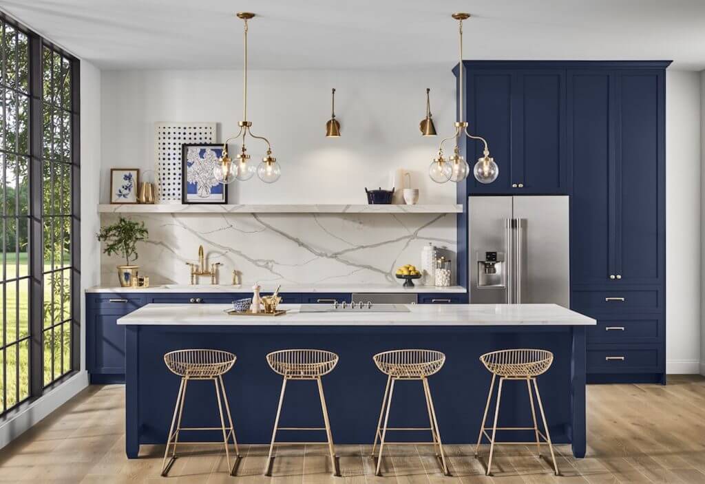
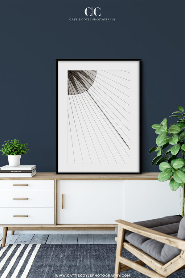
Sherwin-Williams color of the year 2020 is called “Naval” and it’s a beautiful, calm and soothing dark blue, which I have seen some of my favorite interior designers use as a kitchen accent color for quite a while already, but now it’s expanding to the walls.
Sherwin-Williams says “People want to feel grounded and inspired to pursue their mental, physical and emotional well-being. Naval is reminiscent of the night sky, which people have looked to for centuries for guidance, as a muse and as a reminder to live more mindfully.”
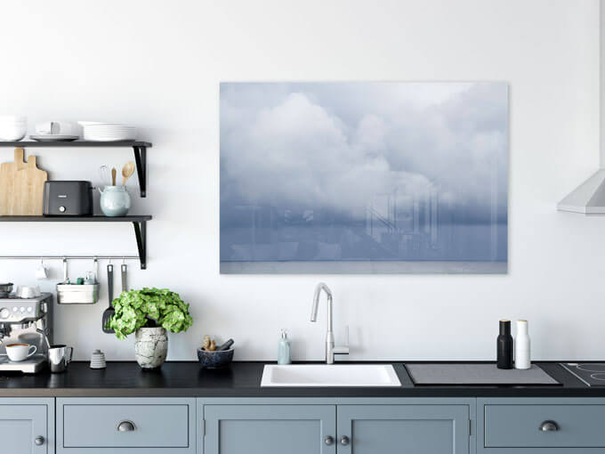
They recommend pairing naval with natural materials, neutral tones and vibrant greenery, and I think simple, minimalist black and white or neutral colored art is a perfect match on these dark blue walls. And if you don’t want an entire room painted dark blue, consider an accent wall or adding it through art and decor.
PPG “Chinese Porcelain”
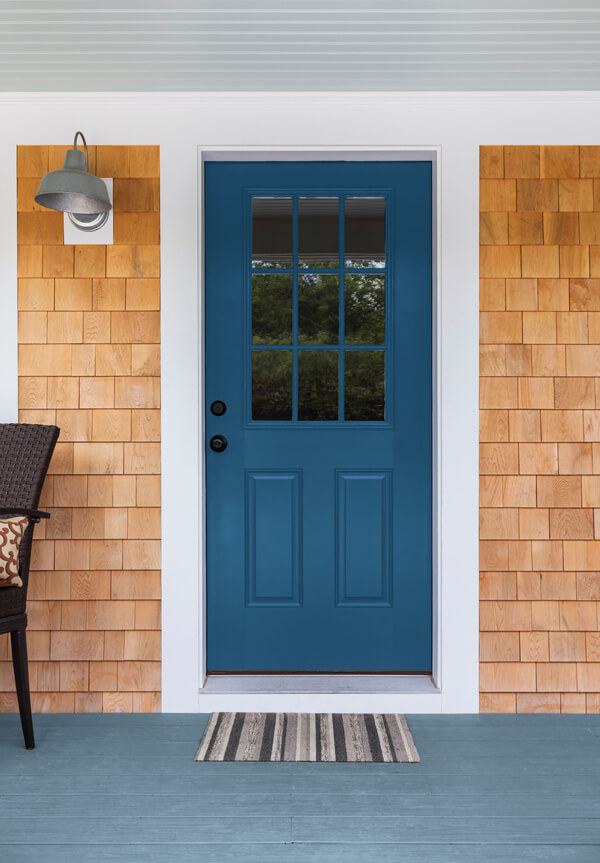
PPG is also going with blue, and their hue is called Chinese Porcelain. They say it’s: “a blend of cobalt and moody ink blue that imparts calmness and restful sleep while also offering the spirit of hopefulness.” PPG’s blue is a little bit lighter and less intense than Naval but just as pretty!

Behr “Back to Nature”
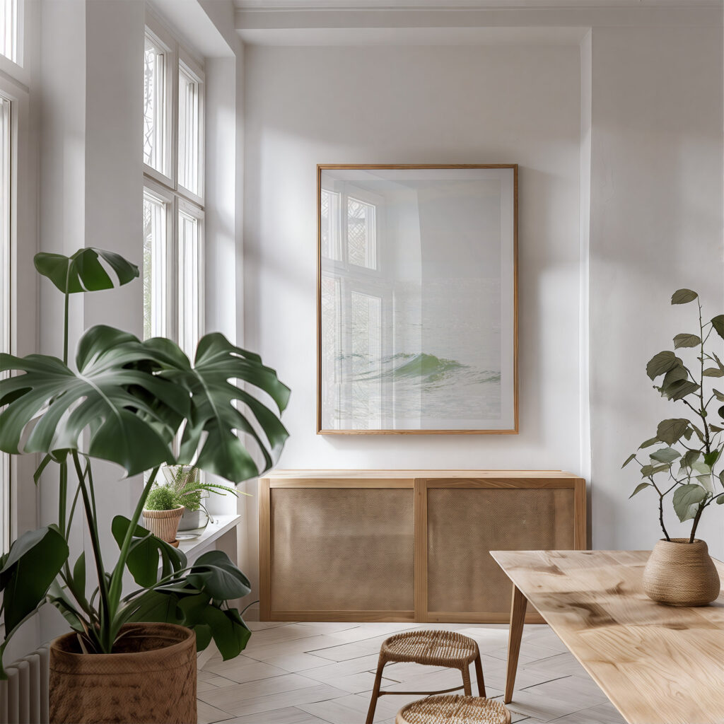
Behr’s “Back to Nature” is a muted, soothing shade of green. Behr says it “encourages us to reengage with the natural world, which we know can have a real, positive impact on our wellbeing”. They recommend pairing it with brown, beige and blue, and I love this hue, I think it’s a very calming and soothing color.
Pantone “Classic Blue”
As expected, Pantone are also going with blue for 2020, and their reasons why are similar to those of the others: “The reassuring qualities of Classic Blue highlight our desire for a dependable and stable foundation on which to build as we cross the threshold into a new era. Imprinted in our psyches as a restful color, PANTONE 19-4052 Classic Blue brings a sense of peace and tranquility to the human spirit, offering refuge. Aiding concentration and bringing laser like clarity, Classic Blue re-centers our thoughts.”
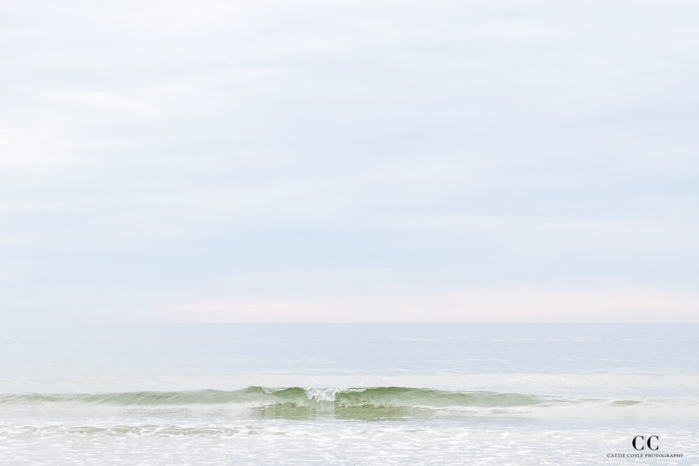
The Green and blue art print collections


